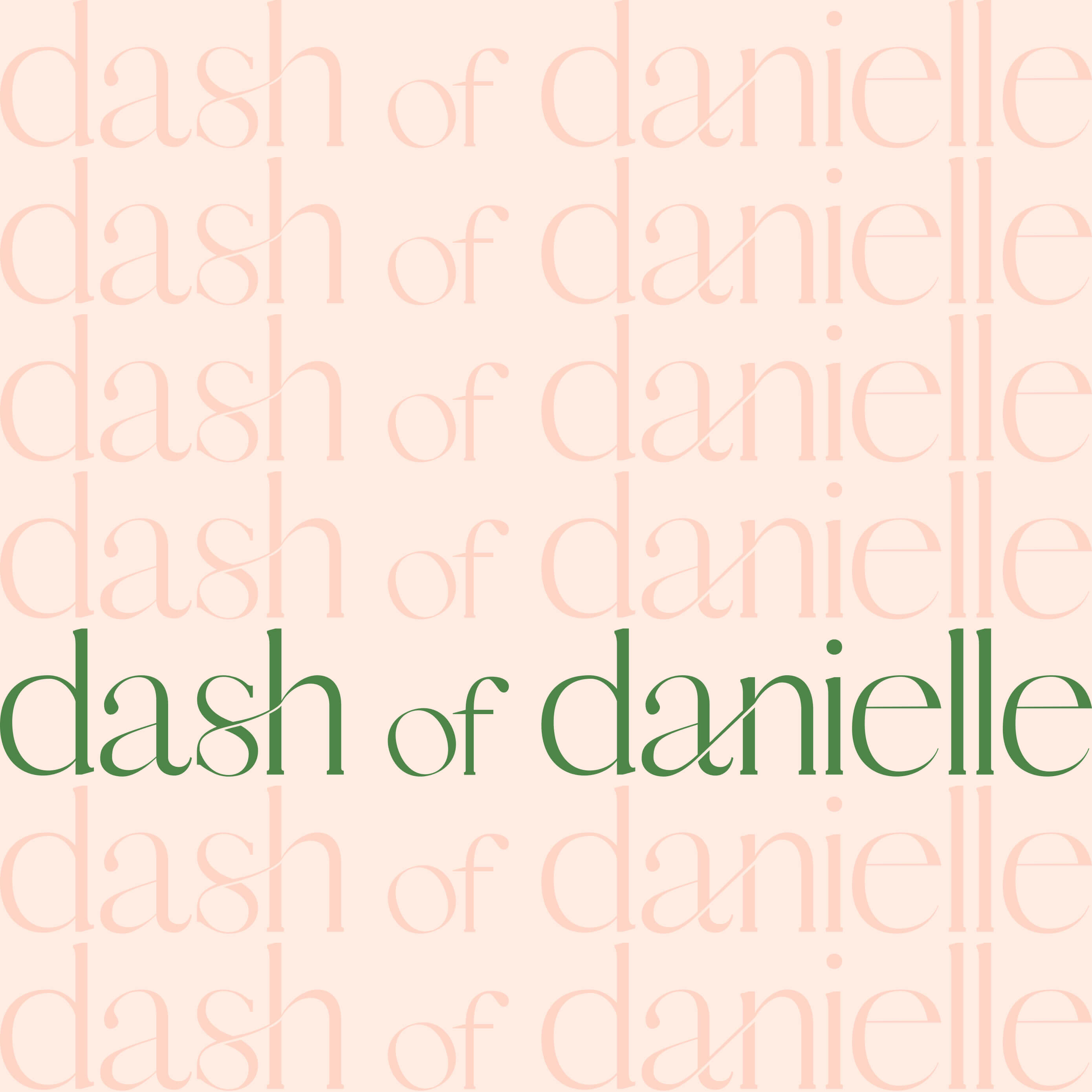
A light-hearted and playful brand for an Instagram food influencer.
Industry
Social Media
Deliverables
Brand Strategy, Visual Identity
We designed a fun and approachable brand identity for Dash of Danielle, a personal blog sharing plant-based, healthy, and delicious recipes.
Danielle Norwitz, founder of the blog, has always been passionate about living a healthy lifestyle. However, it wasn’t until 2019 that she integrated a plant-based diet into her routine and started sharing her recipes on Instagram. Since then, she’s received quite the following—Danielle’s gained 14K followers with her unique content and playful messaging—and she’s just getting started!

Brand Strategy
Dash of Danielle’s brand strategy carefully balances a professional feel that will attract more sponsorships and a lightheartedness that conveys Danielle’s easy-going, sarcastic, and fun personality.

Visual Identity
Logo Concepts
Our Brand Strategy process established key guidelines for developing Dash of Danielle’s logo concepts:
- A professional yet approachable design for sponsorship appeal
- Unique and playful typography reflecting Danielle's personality
- A versatile system for various platforms


Visual Identity
Logo Design
Danielle selected the following concept for its unique, light-hearted feel. The decorative typography better captured the easy-going and playful nature she wanted to convey.


Visual Identity
Brand Colors & Typography
A warm green was chosen as the primary color to reflect one of Danielle's core differentiators—her plant-based recipes. This green is complemented by soft pink, coral, and tan for a warm and welcoming feel. Poppins was selected as the brand’s supporting font for its bubbly, friendly letterforms.


“Lucent Studio is incredible to work with and helped me design my brand from the ground up, which allowed my Instagram to go viral within just a few months.”


